

Agalima

About The Project

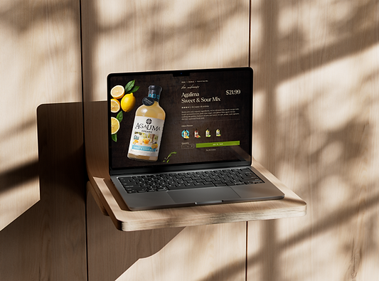
This award winning project is a website re-design for an organic cocktail mixer brand based out of New Albany, Indiana. The project focused on end to end design with an emphasis on creating an experience through strong user interface, research, and client satisfaction. With such a rich brand identity the Agalima website redesign showcased the brand authenticity and boldness through storytelling.
Client: American Beverage Marketers
Project Type: Website Re-Design
Software: Figma
Design Restraints: Brand Guidelines, Client Preferences
Duration: 7 months
Date Created: March 7th, 2023
My Role: Lead UX/UI Designer
Collaborators: Researchers, Copywriter, Project manager, Developer
Awards: Top 100 American Institute of Graphic Arts Award 2024
Overview
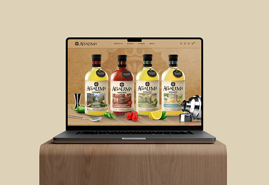
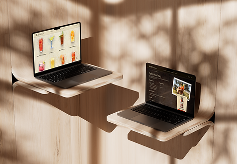
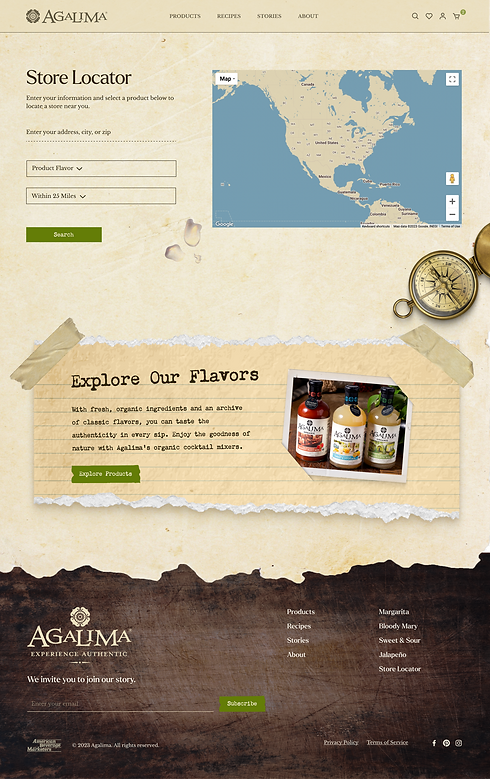
Agalima is a website that helps connects users to high quality organic cocktail mixers. It features a blog to enlighten those who want to learn more about the art of mixology. And also, a recipe library that helps users quickly access the best recipes for each mixer along with step by step instructions and easy to read ingredients list. Each recipe is created by a professional mixologist in house at the American Beverage Marketers headquarters. Also, some recipes can be found paired with an embedded Youtube video to help users follow along easier. The website also features a store locator for users to promptly find the location in which a specific mixer is sold.
Problem Statement
Jason is a full-time bartender working at a local farm to table restaurant who is struggling to find a variety of options of quality organic cocktail mixers and recipes for the restaurant’s signature cocktail menu.
Solution
The goal of this project is to redesign the website to align with Agalima's brand identity and values while emphasizing authenticity and storytelling through interaction design. Also, to improve website usability and ensuring that users can easily find information about Agalima's products, recipes, and company blog all while enhancing the online shopping experience and exceeding client expectations.

Challenges
Some of the few challenges that arose when facing this project was balancing aesthetics with usability to create a visually appealing yet a functional website. Also, ensuring a seamless online shopping experience that integrates with Shopify. And lastly, complying with brand guidelines while adhering to client preferences.


Design Process


Discover
Define
Ideate
Design
Development

Competitor Analysis
Website Audit
User Research
Persona
Empathy Map
Journey Map
Site Map
Task Flows
Moodboards
Design Exploration
Final Improvements
Launch
Style Tile
Prototype
Discover Phase
Qualitative Research
Research revealed through SEO analytics that only 12% of images on the Agamila website are compressed. Image compression is crucial for faster loading and efficient storage, directly impacting webpage loading speed. Addressing this issue is vital to meet the Doherty Threshold, ensuring optimal productivity when users interact with the website within a pace of 400ms or less.
Meta analytics revealed that while the content (photography/videography) is high quality, there is a lack of storytelling and a clear brand identity.
After conducting a competitor audit, the result showed that the brands Q Mixer, Filthy, Jose Cuervo, and Zing Zang, all exhibited bold bright colors and were visually focused. Also, half of the brands were mainly marketed through long and short form videos.

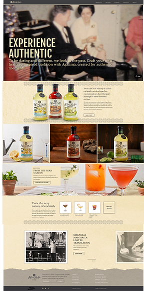
Old Home Page Design
Website Audit
-
Contrast and Accessibility:
-
Identified issues include insufficient contrast in text and logos, impacting accessibility.
-
Lack of clear text hierarchy and responsive buttons impacts the user experience.
-
-
Design Shortcomings:
-
Absence of a compelling call-to-action in the hero header.
-
Lengthy subheaders, condensed text, and inconsistent design elements disrupt visual harmony.
-
-
Checkout Process:
-
Consistency challenges in the checkout process due to WordPress instead of Shopify use, affecting e-commerce.
-
-
Readability and Navigation:
-
Compromised readability with conflicting background elements.
-
Navigation issues stem from a lack of a back button, visible cart icon, and a confusing content gallery arrangement.
-
The integration of a Spotify widget further adds to user confusion due to incongruence with the overall website style.
-
Poor Readability
No Cart Button
Poor Visual Hierarchy
Poor Spacing
Lack Of Contrast
Uneven Layout
No Back Button & Poor Spacing
Define Phase
Personas
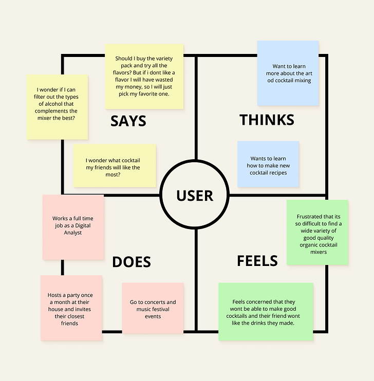
Empathy Map


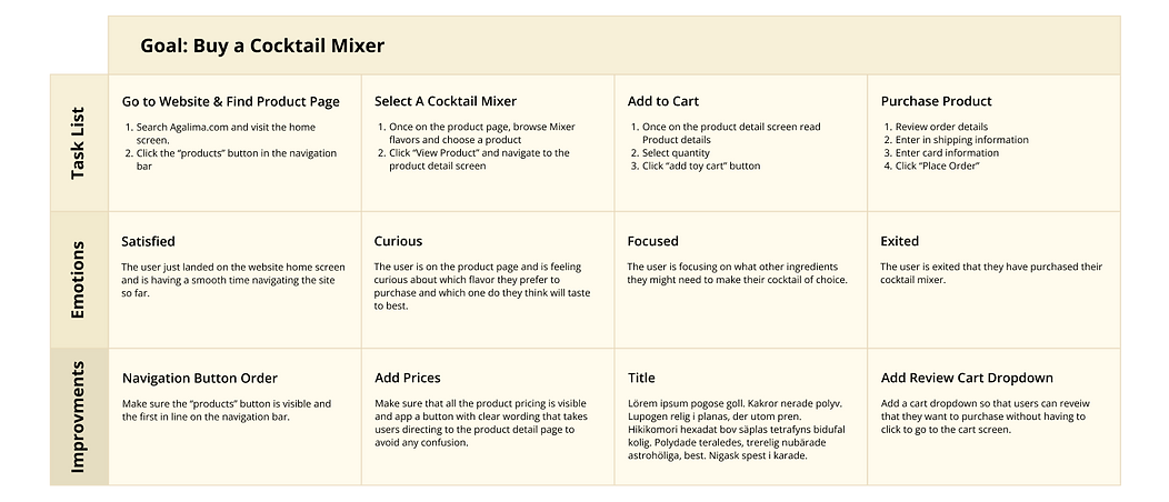
Journey Map
Ideate Phase
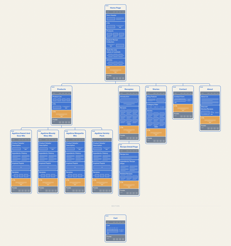
Site Map


Task Flows

Design Phase
Moodboards
Design Exploration

Wireframes

Making Visual Design Choices
When meeting with the client, they expressed that they wanted the overall feel of the design to be an experience like no other. They want to convey authenticity through their brand while showcasing their products on the website as much as possible. In the clients eyes, organic and authentic is one and the same. The ability to express and tell the story of the history of drink mixology is what makes something authentic. But also, the client wanted to showcase the high quality organic ingredients inside the product in the website design as well.
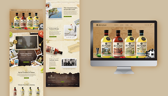
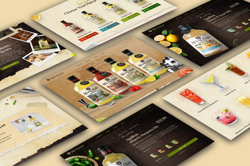
In order to provide that experience, I used polaroids to bring a since of nostalgia and pull from its association with scrapbooks memories. Also, positioning the design layout to appear as though the user is looking at the website at an arial view. This was done to create the affect as though the user is looking through a personal scrapbook. This design choice was important because the client emphasized the lack of “human touch” to their brand and how it needed a sharper connection to their audience.
To incorporate quality and organic ingredients inside the product into the design of the website was no easy task. Brainstorming and coming up with multiple designs each day during the discovery phase hindered some challenges because of users already having preconsived thoughts as to what “organic” means to them compared to what “organic” meant to the client. With these restraints in mind, I chose to infuse the two perceptions of what the client and user version of “organic” is together into one vision. First, the users perception of organic is associated with fresh whole ingredients with an earthy color pallets and live plants. But clients version of organic is perceived through a more human lens. For example, a persons organic characteristics are authentic and truthful through history and memories. In order to combine the the two vision’s of organic together I started with the users version and incorporated fresh ingredients that are used in the cocktail mixers into the design. Also, to further push the concept I added water droplets throughout the website to play with the concept of “ingredients so fresh that they are still wet from being pick off the tree and washed”. Second, to incorporate the clients version organic, I that fused images of fresh ingredients on top of aged paper and distressed wood to portray the look and feel of a scrapbook. I also added Polaroid pictures to create the a sense of “authentic memories” that the client desired. The design elements used together promoted the look and feel of a person cooking in the kitchen, hitting both the clients and users expectation of “organic”.

Styletile
Implementing Color Theory
When designing this website, Color Theory was heavily infused into the thought process of how color would be used throughout the site. For example, the warm earthy color scheme was chosen to create a welcoming atmosphere for users. The deep warm browns in the wood tones used throughout the website promote a cozy feeling as users browse the site. The deep brown tones was added as an edition to the brand because of the subconscious association to Earth and rock, giving the website a more “organic” feel. Also, the green tones buttons were sprinkled throughout the website because of green’s association with lush vegetation, in turn triggering a subconscious feeling of relaxation. The warm beige colored paper gives the background an aged look connecting the association to memories looking through an old family scrapbook. Paired with the Polaroid accents, the look and feel of the website promotes a calming experience.
Website Pages
Home Page

Recipe Page

Product Page

Recipe Page

Blog Page

Margarita Mix Page

Sweet & Sour Mix Page

Recipe Detail Page

Bloody Mary Mix Page

Jalapeño Margarita Mix Page

Store Locator Page
Website & App Mockups






Illustrations & Animations
Development
Improvments
After the developers finish coding the website, right before the launch there is a brief sweep through the site to make sure the design and components function properly. I then document these changes and send them to the developer for later version improvements. As the project came to an end, some of the design choices that I would improve on would be enhancing the recipe filter to function smoother and have a clearer navigation. Also, I would implement more consistent shaped buttons throughout the website and fix some minor spacing errors that occurred during the development phase.
Launch
Key Takeaways
This project was an amazing learning opportunity the grew my skills in public speaking, working under pressure, problem solving, UI design, UX design, research, 2D animation, wire framing, prototyping, design systems, and team work. Throughout each phase of the project I presented to stockholders and decision makers while gathering their feedback and incorporating it into the design. I also had a chance to brush up on my illustration and animation skills to create custom GIF's for the Agalima social media account. I learned so many things while on this project and recognizes that there is always room for improvement and areas to grow in. One of the improvements that I make for future projects is knowing and understanding HTML and CSS.

Thanks For Reading!
Kennedie Nelson
Of Course I must give credit to my amazing team members who helped with is project as well!
Research: Tyler Wilson (Lead Analytics), Brian Hyatt, (COO) Charlie (CCO), Russ Renbarger (CEO), Kennedie Nelson (UX/UI Designer), Tristen DeWitt (Lead Copywriter) Copywriting: Tristen DeWitt (Lead Copywriter) Managers: Maki (Art Director), Charlie (CCO) Development: Claudio Garcia (Lead Developer)


